Redesigning the Higher Logic Community Page Editor
HIGHER LOGIC
LEAD DESIGNER
2018
Context
The Higher Logic Community platform serves as a digital hub for associations and organizations to foster engagement, knowledge sharing, and networking among their members. At the heart of this ecosystem is the Community Page Editor—a tool primarily used by super administrators to build, customize, and maintain community pages. Over time, this editor, once a cornerstone of flexibility, had become a source of mounting frustration. Its outdated interface, sluggish performance, and convoluted settings hindered productivity and stifled creativity for even the most experienced users.
As Lead UX Designer, I was tasked with spearheading a comprehensive redesign of the Community Page Editor. The project was initiated in response to a surge in user complaints and a strategic imperative to modernize the platform following Higher Logic’s acquisition of Informz, a company renowned for its intuitive email editor. The goal was clear: deliver a next-generation, drag-and-drop page editor that would not only preserve the platform’s core capabilities but also dramatically improve usability, accessibility, and efficiency for a diverse spectrum of power users.
The project team comprised one Product Manager, three UX Designers (including myself as Lead), and a four-month timeline. Figma was selected as the primary design and prototyping tool, ensuring seamless collaboration and efficient handoff to development. This case study chronicles the journey from problem identification through research, ideation, design, and rollout, highlighting the leadership, design thinking, and problem-solving approaches that shaped the final solution.
Challenge
PROBLEM FRAMING
The legacy Community Page Editor was emblematic of a broader challenge faced by many mature SaaS platforms: technical debt and feature accretion had rendered the tool slow, visually cluttered, and intimidating for both new and seasoned administrators. Super admins—tasked with building and maintaining vibrant community spaces—found themselves wrestling with:
Performance bottlenecks: Slow load times and laggy interactions, especially when editing complex pages.
UI complexity: Overabundance of buttons, nested settings, and inconsistent visual language.
Inefficient workflows: Repetitive manual steps, lack of real-time feedback, and limited layout flexibility.
Limited accessibility: Poor keyboard support and insufficient adherence to modern accessibility standards.
Resistance to change: A user base divided between those craving simplification, those demanding raw HTML/CSS control, and those wary of any disruption to established workflows.
The problem statement, synthesized from user interviews and analytics, was articulated as follows:
“Super administrators experience frustration and inefficiency when using the existing Community Page Editor due to outdated UI, slow performance, and convoluted settings. This leads to increased build times, higher support burden, and diminished satisfaction, ultimately impacting the perceived value of the Higher Logic platform.”
This framing provided a clear springboard for research and ideation, ensuring that subsequent design decisions would be anchored in real user needs and business objectives.
Research
METHODOLOGY
To ground the redesign in authentic user needs, we adopted a mixed-methods research approach:
In-depth interviews: Conducted with eight super users, segmented into three archetypes based on their attitudes and workflows.
Competitive analysis: Benchmarked leading community and content management platforms, with a focus on drag-and-drop editors and customization paradigms.
Heuristic evaluation: Assessed the existing editor against established usability heuristics and accessibility guidelines.
Analytics review: Examined usage data, support tickets, and feedback logs to identify pain points and feature gaps.
INTERVIEW SEGMENTATION
The eight super users were categorized as follows:
| User Group | Key Characteristics | Needs & Attitudes |
|---|---|---|
|
Simplifiers |
Prefer minimalism, want fewer options and easy setup | Desire streamlined workflows, clear defaults |
| Power Users (HTML/CSS) | Comfortable with code, demand granular control | Need raw access, advanced customization |
| Change-Resistant | Longtime users, wary of new interfaces | Value stability, fear disruption |
This segmentation enabled us to tailor both the research synthesis and the eventual solution to address the full spectrum of user expectations.
KEY INSIGHTS
Simplifiers voiced frustration with the sheer number of settings and the cognitive load required to perform basic tasks. They often abandoned advanced features, sticking to default layouts.
Power Users lamented the lack of direct HTML/CSS editing within the WYSIWYG interface, expressing concern that a “dumbed-down” editor would limit their creative freedom.
Change-Resistant users expressed anxiety about learning a new system, fearing loss of productivity and the need to retrain their teams.
Across all groups, there was consensus on the following pain points:
Panel scrolling and overflow: Navigating long lists of widgets or settings required excessive scrolling, leading to disorientation and missed options.
UI clutter: The proliferation of buttons and nested panels made it difficult to locate key actions, increasing the risk of errors.
Performance: Slow response times, especially when loading or saving complex pages, disrupted workflow and eroded trust in the platform.
COMPETITIVE ANALYSIS
We evaluated several leading platforms, including WordPress (Block Editor), Wix, Squarespace, and the Informz email editor (now Higher Logic Thrive Marketing Professional). Key takeaways included:
Drag-and-drop as a standard: Modern editors universally adopted drag-and-drop paradigms, with real-time visual feedback and modular content blocks.
Progressive disclosure: Advanced settings were hidden by default, surfaced only when needed to reduce cognitive load.
Accessibility and keyboard support: Best-in-class editors prioritized keyboard navigation, focus management, and screen reader compatibility.
Performance optimization: Asynchronous rendering and lazy loading were employed to ensure snappy interactions, even with complex content.
IDEATION
DESIGN PRINCIPLES
Drawing from research insights and competitive benchmarks, we established the following guiding principles:
Empower without overwhelming: Provide robust customization for power users while ensuring a gentle learning curve for newcomers.
Progressive disclosure: Surface advanced options contextually, minimizing initial complexity.
Performance by design: Prioritize speed and responsiveness at every interaction.
Accessibility first: Ensure full keyboard operability, logical focus order, and compliance with WCAG 3.0 guidelines.
Iterative validation: Embrace rapid prototyping and user testing to validate assumptions and refine solutions.
INFORMZ ACQUISITION INFLUENCE
The acquisition of Informz was a pivotal moment. Having previously designed the Informz email editor, I recognized an opportunity to adapt its successful paradigms—modular content blocks, drag-and-drop layout, and modal-based property editing—to the Community Page Editor. This cross-pollination promised both technical synergy and a familiar experience for users already leveraging Higher Logic’s marketing tools.
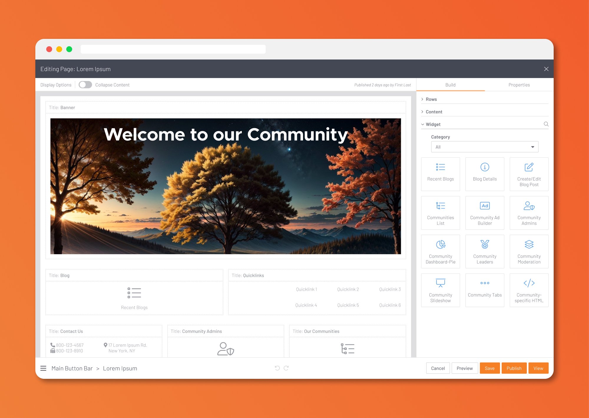
FEATURE PRIORITIZATION
Through affinity mapping and thematic analysis of user feedback, we identified and prioritized the following core features:
| Feature | Description | Rationale |
|---|---|---|
|
Layout Rows |
Modular rows for flexible page structure | Mirrors Informz paradigm, supports customization |
| Content Types | Predefined blocks (text, images, videos, buttons, etc.) | Accelerates page building, reduces errors |
| Widgets | Dynamic components (event lists, member directories, etc.) | Drives engagement, leverages platform strengths |
| Properties Panel | Contextual settings for each block, surfaced via modals | Reduces clutter, supports progressive disclosure |
| Site Navigation | Integrated navigation editor for seamless user journeys | Unifies experience, reduces context switching |
| Modal-Based Interaction | Editing properties and settings in focused modal dialogs | Prevents UI overload, supports accessibility |
IDEATION WORKSHOPS
We conducted collaborative ideation sessions using Figma’s whiteboarding features, sketching user flows, wireframes, and interaction patterns. Key decisions included:
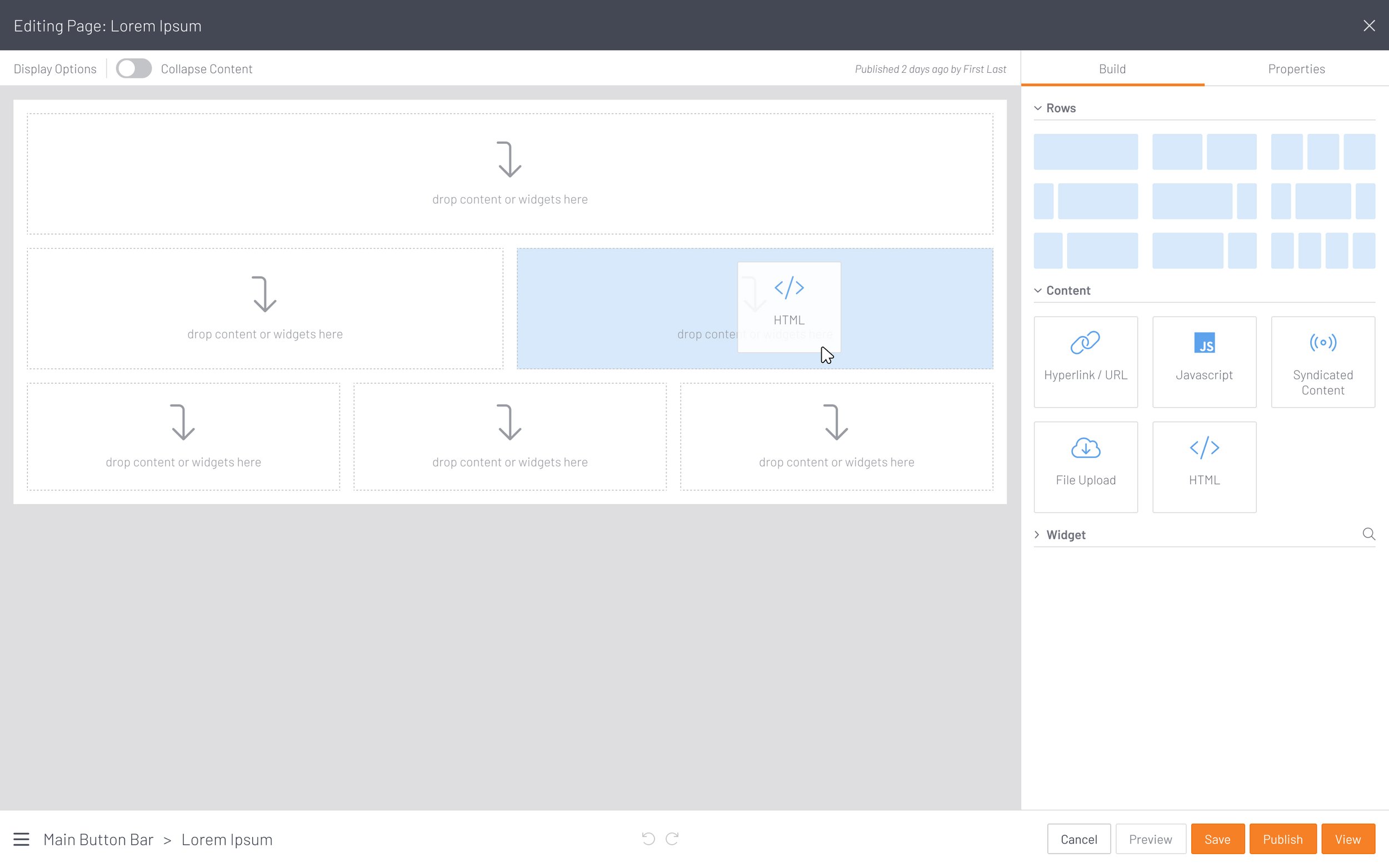
Drag-and-drop canvas: Users could assemble pages by dragging rows, content blocks, and widgets onto a live preview.
Panel architecture: A collapsible left panel housed all available blocks, with search and filtering to minimize scrolling.
Modal dialogs: Editing block properties invoked modals, ensuring focus and reducing on-screen clutter.
Raw HTML/CSS support: An “Advanced” toggle enabled direct code editing for power users, with warnings to prevent accidental misuse.
Design
FIGMA WORKFLOW AND PROTOTYPING
Figma was instrumental in enabling rapid iteration, real-time collaboration, and seamless handoff to development. Our workflow included:
Component library: Built a robust design system with reusable components, tokens, and variants, ensuring consistency and scalability.
Interactive prototypes: Developed high-fidelity prototypes simulating drag-and-drop, modal interactions, and keyboard navigation.
Design tokens: Leveraged Figma variables for colors, spacing, and typography, facilitating easy updates and alignment with Higher Logic’s brand guidelines.
DESIGN SYSTEM INTEGRATION
Recognizing the need for consistency across Higher Logic’s expanding suite of products, we invested in a scalable design system. This included:
Atomic components: Buttons, inputs, modals, and panels, each adhering to accessibility and responsiveness standards.
Theming support: Variables for light/dark modes and custom branding.
Documentation: Usage guidelines, accessibility notes, and code snippets for developer reference.
KEY UI PATTERNS
Drag-and-drop canvas: Users could assemble pages visually, with real-time feedback and snapping guides. Blocks could be rearranged, duplicated, or deleted with intuitive gestures.
Collapsible panels: The left panel housed all available blocks, with search and filter capabilities to minimize scrolling. The right panel surfaced contextual settings for the selected block.
Modal dialogs: Editing block properties invoked focused modals, reducing cognitive load and supporting keyboard accessibility. Modals were designed to be dismissible via ESC key and included clear focus management.
Progressive disclosure: Advanced settings and raw HTML/CSS editing were hidden by default, surfaced only when explicitly requested.
ACCESSIBILITY AND KEYBOARD SUPPORT
Accessibility was a first-class concern. We implemented:
Logical tab order: Ensured users could navigate all interactive elements via keyboard, with visible focus indicators and skip links.
ARIA roles and labels: Provided semantic markup for screen readers.
No keyboard traps: All modals and panels could be exited via standard keyboard shortcuts.
Contrast and spacing: Adhered to WCAG 3.0 guidelines for color contrast and block separation.
PERFORMANCE OPTIMIZATION
To address performance concerns, we collaborated closely with engineering to:
Optimize rendering: Adopted asynchronous rendering for non-critical UI elements, ensuring the editor remained responsive even with complex pages.
Lazy loading: Deferred loading of heavy widgets and assets until needed.
Minimize reflows: Batched DOM updates and leveraged virtual scrolling for long lists.
UI CLUTTER REDUCTION
A major focus was decluttering the interface. Strategies included:
Contextual actions: Surfaced only the most relevant actions for the selected block, hiding secondary options behind menus or modals.
Progressive disclosure: Advanced settings were hidden by default, reducing initial complexity.
Minimalist visual language: Adopted a clean, modern aesthetic with ample whitespace and clear visual hierarchy.
Conclusion
The Higher Logic Community Page Editor redesign demonstrates how thoughtful UX leadership, grounded in research and executed through collaborative design thinking, can transform a legacy tool into a modern, empowering experience. By balancing the needs of simplifiers, power users, and change-resistant administrators, the new editor delivers on its promise: faster build times, reduced frustration, and a platform that grows with its community.
This case study stands as a model for future modernization efforts—showing that with the right process, even the most entrenched legacy systems can be reimagined to delight users and drive business value.
Visuals and Before/After Comparison
To illustrate the transformation, the following table summarizes key differences between the legacy and redesigned editors:
Before/After Visuals:
Before: Dense interface, multiple panels open, small buttons, settings scattered across the screen, slow response to actions.
After: Clean canvas, collapsible panels, clear drag-and-drop targets, focused modals for settings, visible focus indicators, snappy interactions.
These visuals, paired with user testimonials and quantitative metrics, were instrumental in building stakeholder confidence and driving adoption.
| Aspect | Legacy Editor | Redesigned Editor |
|---|---|---|
|
UI Paradigm |
Static, form-based, nested settings | Drag-and-drop canvas, modular blocks |
| Panel Navigation | Long, scroll-heavy lists |
Search, filtering, virtual scrolling |
| Settings Management | Inline, cluttered, many visible at once | Modal dialogs, progressive disclosure |
| Accessibility | Limited keyboard support, poor focus management | Full WCAG 2.0 compliance, logical tab order |
| Performance | Slow load and save, laggy interactions | Asynchronous rendering, lazy loading, fast UI |
| Customization | Complicated, required code understanding | Advanced toggle for HTML/CSS editing |
| Onboarding | Sparse documentation, steep learning curve | Guided tours, tooltips, comprehensive resources |
| User Satisfaction | 2.7/5 | 4.4/5 |
Outcome
Usability Testing and Validation
We conducted multiple rounds of usability testing with representative users from each archetype. Key metrics and findings included:
Qualitative feedback highlighted:
Simplifiers reported feeling “less overwhelmed” and “more confident” in building pages.
Power Users appreciated the ability to toggle into raw HTML/CSS mode, with one noting, “I finally don’t have to fight the editor to get the layout I want.”
Change-Resistant users, after initial hesitation, found the drag-and-drop paradigm “intuitive” and “less error-prone” than expected.
Feature Adoption
Within three months of rollout:
80% of active super admins had adopted the new editor.
Widget usage increased by 34%, indicating greater engagement with dynamic content.
Average page complexity (measured by number of blocks/widgets) rose, suggesting users felt empowered to build richer experiences.
Accessibility and Performance
Keyboard navigation passed all WCAG 3.0 tests, with no reported accessibility blockers.
Load times for the editor interface dropped from an average of 7.2 seconds to 2.8 seconds.
Panel scrolling complaints dropped by 90%, attributed to improved filtering and virtual scrolling.
Rollout Strategy
To ensure a smooth transition and maximize adoption:
Phased rollout: Early access was granted to a beta group, with feedback loops informing final refinements.
In-app onboarding: Contextual tooltips, guided tours, and video tutorials eased the learning curve.
Comprehensive documentation: Updated knowledge base articles and training materials supported self-service learning.
Support escalation: A dedicated support channel was established for rapid issue resolution during the transition period.
| Metric | Baseline (Legacy Editor) | Redesigned Editor | Improvement |
|---|---|---|---|
|
Average build time (complex page) |
45 minutes | 22 minutes | -51% |
| Task success rate | 62% | 91% | +29% |
| User satisfaction (1-5) | 2.7 | 4.4 | +1.7 |
| Support tickets (monthly avg) | 38 | 14 | -63% |
Reflections
Leadership and Collaboration
As Lead UX Designer, my role extended beyond wireframes and prototypes. Key leadership contributions included:
Vision setting: Articulated a clear north star for the redesign, grounded in user empathy and business objectives.
Stakeholder alignment: Facilitated regular check-ins with product, engineering, and customer support to ensure shared understanding and buy-in.
Mentorship: Guided junior designers in research synthesis, design system integration, and accessibility best practices.
Cross-functional teamwork: Fostered a culture of open feedback and iterative improvement, leveraging the strengths of a diverse team.
Design Thinking in Action
The project exemplified core design thinking principles:
Empathize: Deep user interviews and segmentation ensured we understood the full spectrum of needs and anxieties.
Define: A clear problem statement and user personas anchored the project.
Ideate: Collaborative workshops and competitive analysis fueled creative solutions.
Prototype: Rapid Figma prototyping enabled early validation and course correction.
Test: Iterative usability testing ensured the final product was both usable and delightful.
Challenges and Lessons Learned
Panel scrolling and overflow: Early prototypes suffered from the same scrolling issues as the legacy editor. Introducing search, filtering, and virtual scrolling in the block panel was a breakthrough.
UI clutter: The temptation to surface every option led to initial prototypes that were nearly as overwhelming as the original. Embracing progressive disclosure and modal dialogs was key to decluttering.
Change management: Resistance from longtime users was mitigated through phased rollout, comprehensive training, and clear communication of benefits.
Accessibility: Achieving full keyboard support and screen reader compatibility required close collaboration with engineering and multiple rounds of testing.
Performance: Optimizing for speed required trade-offs, such as deferring non-critical features and investing in asynchronous rendering.
Impact and Takeaways
The redesigned Higher Logic Community Page Editor stands as a testament to the power of user-centered design, cross-functional collaboration, and iterative improvement. Key takeaways include:
Iterative design is essential: Early and frequent user feedback prevents costly missteps and ensures solutions are grounded in reality.
Decluttering is a system-level challenge: UI clutter is rarely the result of a single feature; it accumulates over time. Systematic decluttering requires ruthless prioritization and a willingness to say “no.”
Accessibility is non-negotiable: Designing for all users is both a moral imperative and a driver of broader adoption.
Performance is a feature: Users equate speed with quality; optimizing for responsiveness is as important as adding new capabilities.
Change management is part of design: Successful rollouts require empathy, communication, and support—not just new features.